Pickering is a tricky place to pick an exterior colour. The light off Lake Ontario shifts the undertones of every paint chip. Mature maples in older neighbourhoods cast green shade that turns warm greys into something muddier. And the housing stock is all over the map — 1960s bungalows three streets over from glass-and-stone new builds. A colour that sings in a glossy magazine spread might look completely wrong on your specific facade. Here's how we approach exterior colour selection for our Pickering clients.
We've been doing exterior painting across Pickering, Ajax, and Whitbyfor years, and we've learned that exterior colour is less about taste and more about context. Get the context right and most colours look good. Get it wrong and even the “perfect” swatch falls flat.
Why Pickering Is a Tough Light Town
Pickering sits right on the lake, and that matters more than people realize. Lake light is cooler and more reflective than inland light — colours read bluer here than they would in, say, Markham or further north. A warm beige that looked perfect on a sample in your kitchen can read green-grey on a north-facing wall facing the lake.
On top of that, you've got three competing housing eras in one town:
- 1960s–70s ranches and sidesplits with brick bases and aluminum or wood siding above. These have a horizontal feel and benefit from grounded, mid-tone colours.
- 1980s–90s two-storey homes with mixed brick and vinyl, often in builder-grade beige. These are the houses that benefit most from a smart repaint.
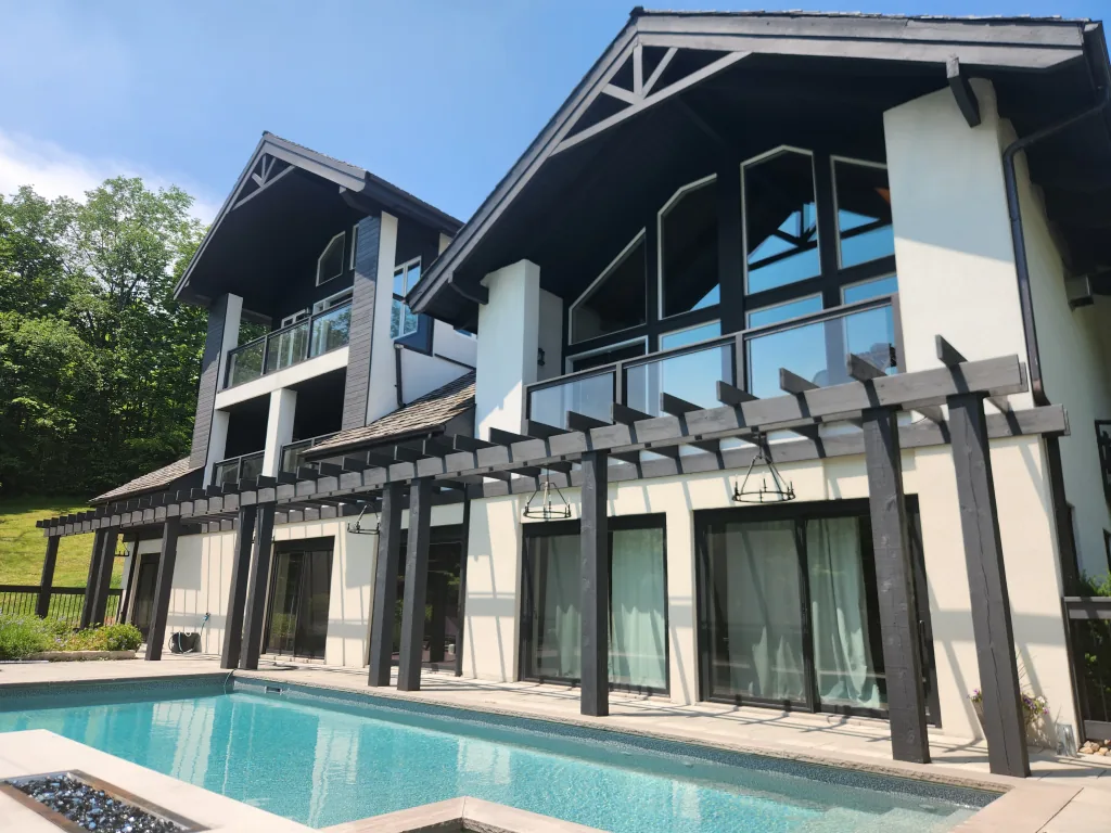
- 2000s and newer builds in Duffin Heights, Seaton, and along the 401 corridor. Big stucco walls, stone accents, contemporary lines. These can carry darker, more dramatic palettes.
The colour that flatters one of these will fight with the others. Step one is always identifying which era your house is actually in.
Look at the Neighbourhood Before the Swatch
Before you fall in love with a colour, walk the block. Not to copy — to calibrate. You're looking for the rhythm of the street and, more importantly, the fixed elements on your own house that you cannot change:
- Your roof colour. Most asphalt shingles in Pickering are charcoal, brown, or a black-brown blend. Each pushes the rest of your palette in a different direction. A warm brown roof fights with a cool blue siding choice.
- Brick or stone. Existing brick is the boss of your palette. You're either matching it tonally, complementing it with a clean contrast, or working in a deliberate “monochrome” family.
- Window frames. White vinyl windows lock you into a cooler trim story. Black-framed windows on newer builds open up a darker, more dramatic palette.
- Driveway, walkway, landscaping. Concrete, interlock, garden beds — these are all colours too. Stand at the curb and squint.
Your siding colour has to live in conversation with five other colours you didn't choose. The roof, the brick, the windows, the soffit, the front door. Pick the siding last, not first.
The roof is a colour. Always sample with the roof and brick in frame. We see homeowners hold a swatch against a blank wall and decide — only to find the colour clashes the moment they step back and see the whole house.
The 60-30-10 Rule for Exterior Palettes
The 60-30-10 rule is a designer's framework that translates perfectly to exterior work. It gives you proportions that consistently look balanced:
- 60% — main body colour. This is your dominant siding or stucco. Pick this last and let it serve the rest of the palette.
- 30% — secondary colour. Brick, stone, a second siding material, gables in a contrasting shade. On many homes this is already fixed.
- 10% — accent. Trim, fascia, soffits, the front door. This is where you get to have fun. It's also where the “wow” lives — the colour everyone notices from the street.
Most exteriors that feel “off” are violating these proportions — usually by using too many competing colours at 30% each, with no clear hero.
Five Palette Directions That Work in Pickering
These are the five exterior direction we've used most over the last two years on Pickering homes. Each one works for a specific architectural era, light condition, and neighbourhood context.
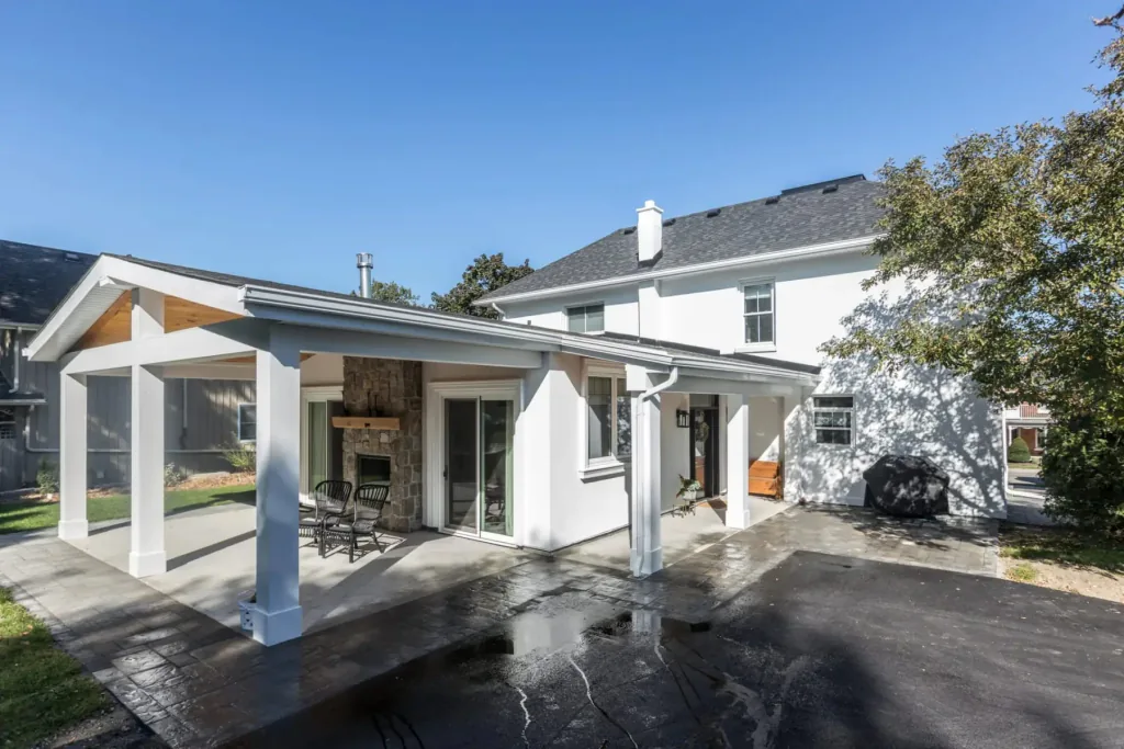
- Warm white + black trim. Body in Benjamin Moore White Dove (OC-17) or Simply White (OC-117), trim and accents in Benjamin Moore Black (2132-10). Crisp, modern, photographs beautifully. Works best on 2000s+ builds with clean lines.
- Deep navy + cream. Body in Hale Navy (HC-154), trim in Cloud White (CC-40), front door in something bold like Caliente red. The classic east-coast colonial look — flatters two-storey homes with mixed materials.
- Greige modern. Body in Revere Pewter (HC-172) or Sherwin-Williams Agreeable Gray (SW 7029), trim in Decorator's White, accent in a deep blue or black door. The safest sophisticated palette in the GTA — and there's a reason it's everywhere.
- Charcoal moody. Body in Iron Mountain (2134-30), trim in Black or matching charcoal for a tone-on-tone effect, door in a saturated colour. Phenomenal on new builds with black windows. Avoid on south-facing facades unless you're committed to repainting in five years.
- Classic brick-matched. Body colour pulled from the lighter tones in your existing brick — usually a warm putty or soft taupe — with crisp white trim. This is the “you can't tell it's repainted, but the house looks 10 years younger” approach.
Colours to Avoid (Unless You're Sure)
Some colours look great in inspiration photos and fail in the field. A few to be careful with:
- Very dark colours on south-facing facades. Heat absorption is real — dark surfaces can hit 70°C in July, which accelerates substrate movement and stresses the coating. Fade rates on saturated darks are 25–35% faster than mid-tones.
- Pure brilliant white. Picks up every speck of grime, road salt, and pollen. Off-whites like Simply White or Cloud White stay clean-looking longer.
- Trendy “moment” colours. The mustard yellows, the sage greens with too much yellow, the millennial pinks. They look dated in five years and you're stuck with them for ten.
- Cool greys on north-facing walls. Without warm sunlight to balance them, cool greys read flat-out blue or purple. We've walked clients off this ledge more than once.
- Anything you saw in California. The light is different. The vegetation is different. The roof colours are different. Trust us on this.
Pickering Pro tip: South-facing facades fade 30% faster than north-facing ones. If you want a deep saturated colour on a south wall, commit to a 6-year repaint cycle — or choose a lighter value that holds its colour longer.
Sampling Properly — The Step Most Homeowners Skip
This is the single biggest difference between a great exterior and a disappointing one. Sampling is not painting a 4-inch swatch next to your front door and deciding the next morning. Here's how to do it right:
- Buy sample pots, not chips. Chips are printed; paint is mixed. They're not the same colour. Get pints from your supplier.
- Paint large boards, not the house. 2'×2' foam boards or hardboard, two coats. Big enough that the colour reads as itself, not as something tinted by what's next to it.
- Move the boards to all four exposures. North, south, east, west. The same colour will look like three different paints depending on which side of the house it sits on.
- View at multiple times of day. 8 AM, noon, 4 PM, and dusk. Across at least two days. Cloudy and sunny both.
- Stand at the curb. Don't evaluate from three feet away. The colour you live with is the colour seen from the sidewalk.
Our Favourite Benjamin Moore & Farrow & Ball Picks for Pickering
Ten colours we keep coming back to for Pickering exteriors, with the codes so you can pull samples yourself:
Main body colours:
- Benjamin Moore Simply White (OC-117) — clean, warm, the safest white
- Benjamin Moore White Dove (OC-17) — softer than Simply White, hides dirt better
- Benjamin Moore Revere Pewter (HC-172) — the workhorse GTA greige
- Farrow & Ball Cornforth White (No. 228) — soft warm grey with depth; gorgeous in lake light
- Benjamin Moore Hale Navy (HC-154) — the navy that doesn't go purple
- Benjamin Moore Iron Mountain (2134-30) — sophisticated charcoal for new builds
- Sherwin-Williams Agreeable Gray (SW 7029) — warm greige with broad appeal
Trim & accents:
- Benjamin Moore Cloud White (CC-40) — warm enough to pair with almost any body colour
- Benjamin Moore Decorator's White (CC-20) — cleaner, cooler trim for modern palettes
- Benjamin Moore Black (2132-10) — a true black with no muddy undertones
Front doors:
- Farrow & Ball Hague Blue (No. 30) — deep, atmospheric, looks expensive
- Benjamin Moore Caliente (AF-290) — the classic confident red
- Benjamin Moore Black Beauty (2128-10) — black with the faintest blue depth
Trim & Front Door — The Quick Win
If a full exterior repaint isn't in this year's budget, the cheapest, fastest curb-appeal upgrade is your trim and front door. We've done weekend jobs in Pickering where we repainted just the fascia, soffits, garage trim, and front door, and the transformation was dramatic enough that neighbours stopped to ask.
Rules of thumb for the door-and-trim play:
- If your siding is light, go dramatic on the door — deep navy, black, or a saturated red.
- If your siding is dark, lean into contrast with a warm cream or a high-chroma colour like teal or burnt orange.
- Match the door to your house numbers and exterior light fixtures for cohesion.
- Always paint the front door in a full gloss or semi-gloss — flat or eggshell on a door looks unfinished and shows wear quickly.
How a Professional Colour Consultation Works
On every exterior paintingproject we quote, colour consultation is included. Here's what that actually looks like:
- Site visit. We walk the property and photograph the house in current light. We note roof colour, brick, windows, hardscaping, and the homes on either side.
- Direction conversation. What does the client want this house to feel like? Warm or cool? Classic or modern? Quiet or statement? We narrow to two or three palette directions.
- Sample boards. We prepare 2'×2' sample boards in the leading options and place them on the house. Client lives with them for 3–5 days.
- Final selection. We confirm body, trim, accent, and door colours in writing — with exact codes, sheens, and supplier. That document goes into the project file.
We do the same for clients who want their interior painting to flow visually with the new exterior — the front door and trim colours often anchor the entry hall palette.
Ready to start figuring out what your Pickering home should look like? Send us photos of your current exterior and a couple of inspiration shots — we'll come back with two or three palette directions and a rough quote. Get in touch here, or scroll through our recent exterior projects across Pickering, Ajax, and the eastern GTA to see how these palettes play out in the real world.